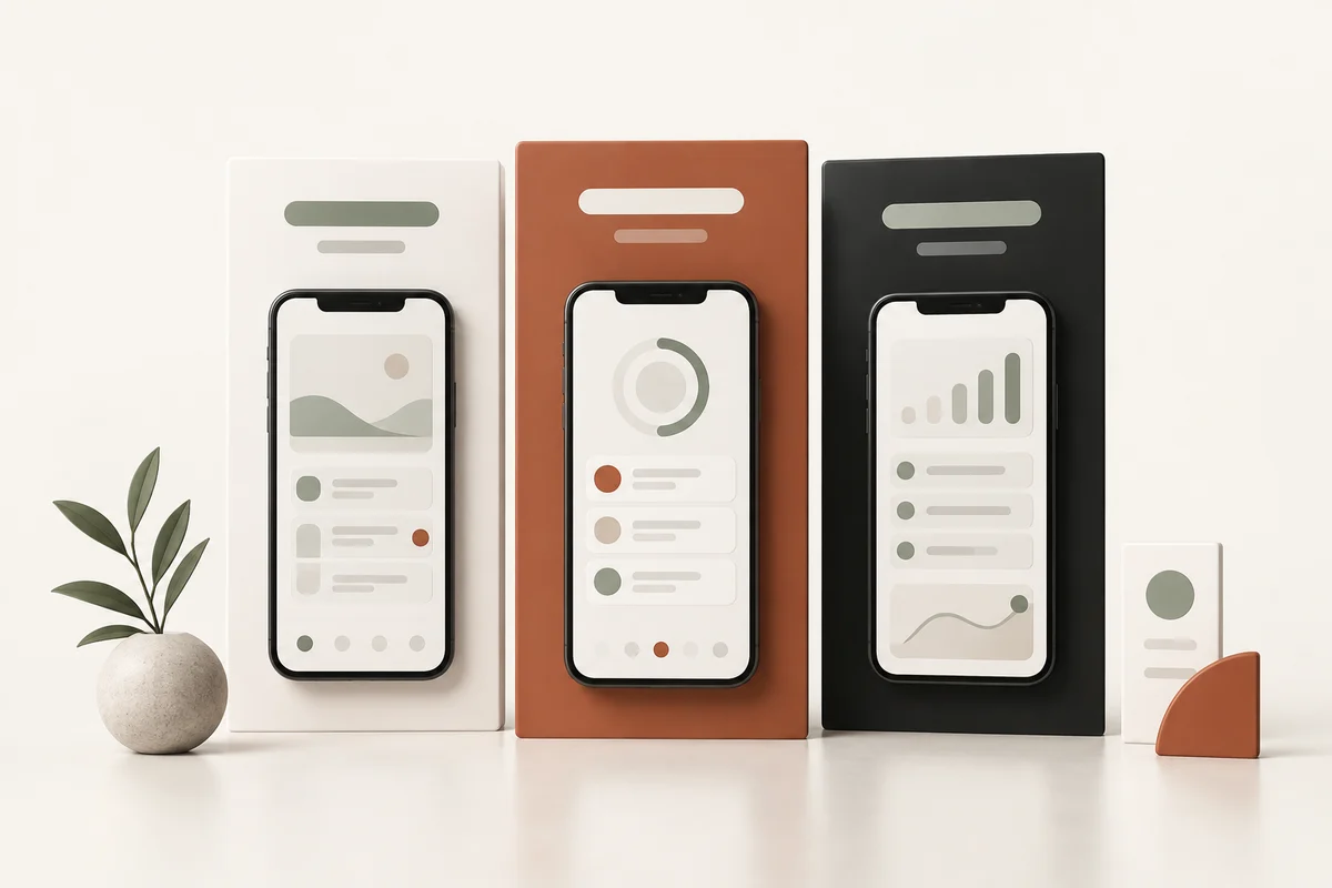
Use a screenshot size accepted for the device family your app supports, then verify the actual file before uploading. The phone frame in your design does not determine the exported image size. A correctly sized canvas can still contain clipped text, a distorted phone or unreadable UI.
The values below were checked against Apple and Google documentation on September 11, 2026. The screenshot size calculator can help you look up supported dimensions; use the editor to create and export artwork.
Common Apple screenshot dimensions
| Submission family | Accepted portrait examples | How to use them |
|---|---|---|
| iPhone 6.9-inch | 1260 × 2736; 1290 × 2796; 1320 × 2868 | Use an accepted size for this display family; landscape swaps width and height |
| iPhone 6.5-inch | 1242 × 2688; 1284 × 2778 | Required for an iPhone app when 6.9-inch screenshots are not provided |
| iPad 13-inch | 2064 × 2752; 2048 × 2732 | Required when the app runs on iPad |
Apple's screenshot specifications are the source of truth for accepted sizes and fallback behavior. Do not infer required device coverage from a marketing label such as "latest iPhone." Smaller families have their own accepted sizes and scaling rules.
Apple allows one to ten screenshots for a supported size and localization. Provide real app content, and check which device families your binary supports. An iPhone-only app does not need an iPad campaign simply because an editor can export one.
Other Apple device families
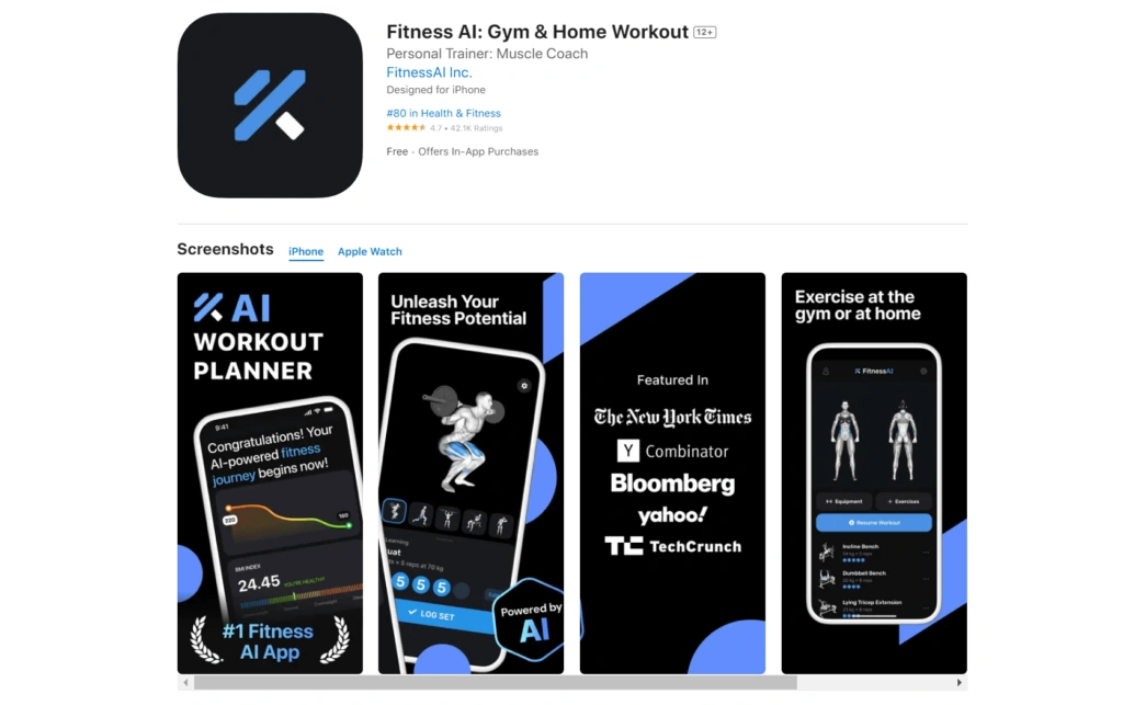
Mac, Apple TV, Apple Watch and Apple Vision Pro use different submission sizes. For example, Apple lists 16:10 sizes for Mac screenshots and separate specifications for watch displays. Check the actual family in App Store Connect before preparing the final set.
Do not assume a phone mockup can represent a watch or tablet experience. Capture the supported interface and verify the layout on that device. Check the app itself on each supported device, too.
Google Play uses different rules
For general phone screenshots, Google specifies JPEG or 24-bit PNG without alpha, dimensions from 320 to 3840 pixels and a maximum long dimension of twice the short dimension. It allows up to eight screenshots per supported device type, with additional requirements for particular form factors and promotional eligibility.
Check the full Google Play preview-asset guidance. Its large-screen instructions specify at least four screenshots and dimensions from 1080 to 7680 pixels for tablets and Chromebooks. Watch, TV, automotive and XR listings have their own requirements. Do not treat the phone limits as universal.
Check which rules apply to publishing and which apply to promotional placements. Prepare assets for the devices your app supports.
Capture the actual UI before adding presentation
Use a real device or a suitable simulator to capture the app's current interface. Remove private information and use clearly fictional sample data when appropriate. Check that the app state shown is one a customer can actually reach.
Automated capture can help with recurring releases. fastlane snapshot runs iOS UI tests to collect screenshots across configured devices and languages. It requires an app project and maintained tests; it does not create a marketing story by itself.
Keep the raw captures separate from the finished campaign. When the product changes, replacing the original capture should not require reconstructing every caption and background.
Design at the intended output size
Start with the intended store canvas, then add the app capture, optional frame and caption. Preserve the UI aspect ratio. Avoid stretching a phone capture to fill a tablet display or using an enlarged low-resolution capture when a new one is available.
The screenshot editor supports reusable layouts and exports for supported sizes. Free templates can be edited and exported with a free account; Pro collections retain their access requirements. Manual editing does not consume AI tokens, while generation and translation use their displayed costs.
For a complete workflow, follow the screenshot creation tutorial. Select the exact export size, because the phone model used as a visual frame does not determine the output dimensions.
Check captions, cropping and readability
Inspect each export in two ways: at native resolution for artifacts and at small size for comprehension. The caption should correspond to the visible feature. Use a clear hierarchy and enough contrast without hiding meaningful UI behind large decorative elements.
Keep the first useful message early in the gallery, but inspect the real store surface rather than assuming every visitor sees exactly three screenshots. Orientation, device and preview videos can change the initial presentation.
The screenshot design guide covers sequencing and copy. Correct dimensions support a valid upload; they do not guarantee a conversion improvement.
Localize and inspect each exported set
A translation can wrap onto another line or change the balance of a layout. Review names, dates, currencies, sample data and in-app language. A translated caption above an untranslated screen may create a confusing promise.
Use a fluent reviewer and confirm that the app can serve the market shown. Have someone fluent review AI translations. Name each export so you can match it to the right language in the store console.
Export and submission checklist
- Dimensions: inspect the actual file width and height, not only the editor preset.
- Format: use a store-supported format and remove alpha where required.
- Image quality: check sharpness, text edges and compression artifacts.
- Content: confirm current UI, supported features and appropriately labeled sample data.
- Order: verify the gallery sequence and filenames for each locale.
- Device scope: provide the assets needed by the app's supported device families.
- Publication: check the live listing after review; upload completion is not public availability.
If a file is rejected, compare its dimensions and format with the specific console error first. Fix the failing requirement before redesigning the artwork. The free screenshot resizer checks size, format and a hidden alpha channel, and converts files to the required sizes in your browser. Save the accepted export settings with the project for the next release.
Keep preview video specifications separate
App previews have their own resolution, duration, codec and size requirements. A valid screenshot resolution is not automatically a valid video resolution. Check the video specification before recording to avoid rebuilding the edit later.
Use the app preview video guide when motion helps explain your product. A video remains optional in many listing workflows and is not inherently better than a clear static gallery.
Frequently asked questions
Are 6.9-inch iPhone screenshots always mandatory?
Apple currently lists 6.5-inch screenshots as required for an iPhone app if 6.9-inch screenshots are not provided. Use the accepted sizes and fallback rules in the current Apple screenshot specification and App Store Connect.
Do all apps need iPad screenshots?
No. Apple requires the iPad screenshot family when the app runs on iPad. Check the device support of your app instead of assuming every iPhone listing also needs iPad artwork.
Can I use the same screenshot file for Apple and Google Play?
Only if it meets both applicable specifications and accurately represents the supported experience. Validate format, dimensions, aspect ratio and device-specific content requirements separately.
Does a screenshot size calculator export my campaign?
A size reference or calculator helps you choose and check dimensions. Use a screenshot editor to create and export the finished artwork, then inspect the actual downloaded file.